
How to Choose Wall Art for Your Pet’s Portrait
A guide to choosing the right wall art for your fine art pet portrait — from print type and size to where it belongs in your home. Amy Watters Photography – fine art pet photography in Buckinghamshire.
Booking the session is the easy part. Choosing how your pet’s portrait actually lives in your home afterward is where most people pause — not because it’s difficult, but because it’s the first time the portrait stops being an idea and starts being a real object, in a real room, on your wall for years to come.
Here’s how to think it through.
Start with the wall, not the portrait
The instinct is to pick the piece first and find a spot for it later. Better to work the other way round. Stand in the space you already have in mind — a hallway, a stairwell, above a console table, the empty run of wall at the top of the stairs — and consider it properly.
- How is it lit? Natural light through the day, or mostly lamp-lit in the evening? Dark, painterly portraits hold their depth beautifully under warm lamp light, which is part of why they work so well in hallways and living rooms.
- How far away will it usually be seen from? A stairwell is often viewed from a distance and benefits from a larger, bolder piece. A console table portrait is seen close up, where finer detail and texture matter more.
- What’s already on that wall? A single statement portrait works differently to a gallery wall of two or three smaller pieces alongside family photographs.
The three formats, and when each one earns its place
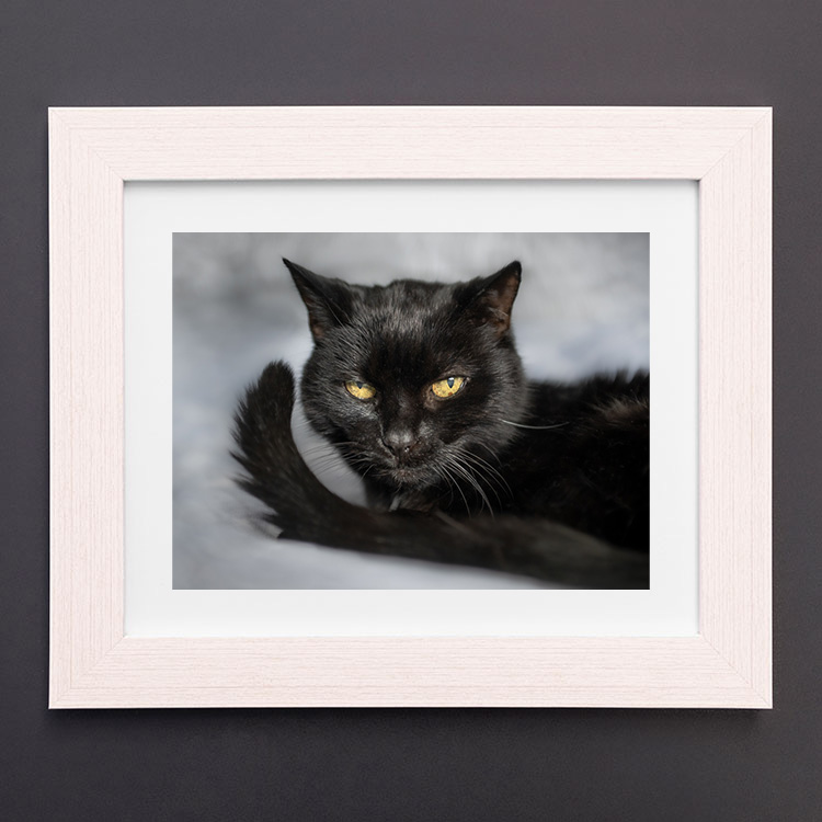
Framed fine art print. The classic choice, and usually the right one for a single statement piece. Printed on archival paper and set behind glass or acrylic, it has real presence and a formality that suits hallways, studies, and living rooms. Frame choice matters as much as the print — a dark wood or aged gold frame will sit closer to the Old Masters tone of the portrait itself than a plain white one.
Canvas. Frameless, textured, and slightly more relaxed than a framed print. Canvases tend to suit larger sizes well and work nicely above furniture — a sofa, a sideboard, a bed — where you want scale without the visual weight of a frame. They also handle busier, more layered walls better than glass, which can pick up glare.
Gallery block / fine art panel. A smaller, often square or portrait-format piece mounted directly to a rigid panel, no frame. These suit gallery-wall arrangements particularly well — grouped in twos or threes, mixed with smaller studies or detail shots, built up gradually over time rather than committed to in one go.
A rough sizing guide
As a general rule of thumb:
- Above a console table or sideboard: roughly two-thirds the width of the furniture beneath it.
- In a stairwell or hallway with distance to view from: go larger than instinct suggests — a portrait that looks generous close up often reads as merely “nice” from ten feet away.
- Above a sofa or bed: roughly 60–75% of the width of the piece of furniture, so the portrait doesn’t float.
- Gallery wall groupings: vary the sizes rather than matching them exactly — one larger anchor piece with one or two smaller companions tends to look more intentional than a uniform set.
Let the portrait’s mood guide the room
A dark, dramatic portrait doesn’t need a dramatic room to work — in fact, it often has the most impact somewhere quiet and neutral, where it isn’t competing for attention. Think about hallways, staircases, and studies – transitional spaces that people pass through slowly, rather than sit and scroll past.
If the room is already busy — patterned wallpaper, a lot of furniture, other art — a single, well-framed piece with generous space around it will read far better than a second or third print squeezed in alongside everything else.
Most clients know within a few minutes which piece, and which size, is right.
Already booked a session, or thinking about one? I can help you choose the right print, frame, and size for your home before a single piece is ordered. Explore collections and enquire →